先貼效果圖:
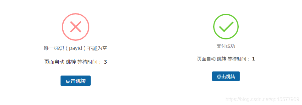
優點:圖標是有動畫效果的,不需要背景圖片���。
1��、需要引用一個dialog.css,代碼如下:
/* ===========================================
 @des:     dialog.less
 @author:   美奇軟件開發工作室
 @QQ:     15577969
 @贊助平臺:  元寶支付(18pay.net)
 @time:    2021-01-10
 =============================================*/

@charset "utf-8";
.clearfix {
 *zoom: 1;
}
.clearfix:after {
 visibility: hidden;
 display: block;
 font-size: 0;
 content: " ";
 clear: both;
 height: 0;
}
* {
 margin: 0;
 padding: 0;
}
ul,
ol {
 list-style: none;
}
img {
 border: none;
}
input,
select,
textarea {
 outline: none;
 border: none;
 background: none;
}
textarea {
 resize: none;
}
a {
 text-decoration: none;
}
.body {
 font-family: 14px "Microsoft Yahei", "微軟雅黑", Arial, Tahoma;
}
.btn-container {
 width: 100%;
 display: flex;
 display: -webkit-flex;
 display: -moz-flex;
 justify-content: space-around;
 -webkit-justify-content: space-around;
 -moz-justify-content: space-around;
}
.btn-container input[type='button'] {
 width: 20%;
 padding: 0.357rem;
 color: #fff;
 border-radius: 3px;
 -webkit-radius: 3px;
 -moz-radius: 3px;
 background-color: #3B9DFF;
}
.btn-container input[type='button']:active {
 background-color: #1966b3;
}
/*重置盒模型 */
.boxContent * {
 box-sizing: content-box;
 -webkit-box-sizing: content-box;
 -moz-box-sizing: content-box;
}
/*animation start*/
#animationTipBox {
 width: 100%;
 height: auto;
 background-color: #fff;
 border-radius: 8px;
 -webkit-border-radius: 8px;
 -moz-border-radius: 8px;
 position: fixed;
 left: 50%;
 top: 30%;
 margin-left: -50%;
 margin-top: -75px;
 z-index: 1001;
 -webkit-animation: alertAnimation 0.3s ease-in-out 0s 1;
 -moz-animation: alertAnimation 0.3s ease-in-out 0s 1;
 animation: alertAnimation 0.3s ease-in-out 0s 1;
}
#animationTipBox * {
 box-sizing: content-box;
 -webkit-box-sizing: content-box;
 -moz-box-sizing: content-box;
}
#animationTipBox .icon {
 position: relative;
 width: 80px;
 height: 80px;
 border-radius: 50px;
 -webkit-border-radius: 50px;
 -moz-border-radius: 50px;
 border: 4px solid #66cc33;
 margin: 15px auto 5px auto;
}
#animationTipBox .icon_box {
 width: 80px;
 height: 80px;
 margin: 0 auto;
 text-align: center;
 position: relative;
}
#animationTipBox .lose .icon {
 border-color: #FF9090;
}
#animationTipBox .lose .icon_box {
 -webkit-animation: lose_Animation 0.5s ease 0s 1;
 -moz-animation: lose_Animation 0.5s ease 0s 1;
 animation: lose_Animation 0.5s ease 0s 1;
}
#animationTipBox .dec_txt {
 font-size: 16px;
 text-align: center;
 color: #666;
 line-height: 26px;
 height: 26px;
 padding: 5px 0 10px 0;
}
.tip .icon {
 width: 80px;
 height: 80px;
 background-color: #66cc33;
 border-radius: 100%;
 -webkit-border-radius: 100%;
 -moz-border-radius: 100%;
 color: #fff;
 font-size: 80px;
 text-align: center;
 line-height: 80px;
}
.success .line_short {
 width: 25px;
 height: 5px;
 position: absolute;
 left: 14px;
 top: 46px;
 border-radius: 4px;
 -webkit-border-radius: 4px;
 -moz-border-radius: 4px;
 background-color: #66cc33;
 transform: rotate(45deg);
 -webkit-transform: rotate(45deg);
 -moz-transform: rotate(45deg);
 -webkit-animation: success_short_Animation 0.65s ease 0s 1;
 -moz-animation: success_short_Animation 0.65s ease 0s 1;
 animation: success_short_Animation 0.65s ease 0s 1;
}
.success .line_long {
 width: 47px;
 height: 5px;
 position: absolute;
 right: 8px;
 top: 38px;
 border-radius: 4px;
 -webkit-border-radius: 4px;
 -moz-border-radius: 4px;
 background-color: #66cc33;
 transform: rotate(-45deg);
 -webkit-transform: rotate(-45deg);
 -moz-transform: rotate(-45deg);
 -webkit-animation: success_long_Animation 0.65s ease 0s 1;
 -moz-animation: success_long_Animation 0.65s ease 0s 1;
 animation: success_long_Animation 0.65s ease 0s 1;
}
.lose .line_left,
.lose .line_right {
 width: 47px;
 height: 5px;
 position: absolute;
 left: 17px;
 top: 37px;
 border-radius: 4px;
 -webkit-border-radius: 4px;
 -moz-border-radius: 4px;
 background-color: #FF9090;
 transform: rotate(45deg);
 -webkit-transform: rotate(45deg);
 -moz-transform: rotate(45deg);
}
.lose .line_right {
 right: 11px;
 top: 37px;
 transform: rotate(-45deg);
 -webkit-transform: rotate(-45deg);
 -moz-transform: rotate(-45deg);
}
/* 總體動畫 函數 */
/*all animate*/
@-webkit-keyframes alertAnimation {
 0% {
  -webkit-transform: scale(0.5);
 }
 45% {
  -webkit-transform: scale(1.25);
 }
 80% {
  -webkit-transform: scale(0.95);
 }
 100% {
  -webkit-transform: scale(1);
 }
}
@-moz-keyframes alertAnimation {
 0% {
  -webkit-transform: scale(0.5);
 }
 45% {
  -webkit-transform: scale(1.25);
 }
 80% {
  -webkit-transform: scale(0.95);
 }
 100% {
  -webkit-transform: scale(1);
 }
}
@-webkit-keyframes alertAnimation {
 0% {
  -webkit-transform: scale(0.5);
 }
 45% {
  -webkit-transform: scale(1.25);
 }
 80% {
  -webkit-transform: scale(0.95);
 }
 100% {
  -webkit-transform: scale(1);
 }
}
/*all animate*/
/*success short animate*/
@-webkit-keyframes success_short_Animation {
 0% {
  width: 0;
  left: 1px;
  top: 19px;
 }
 54% {
  width: 0;
  left: 1px;
  top: 19px;
 }
 70% {
  width: 50px;
  left: -4px;
  top: 37px;
 }
 84% {
  width: 17px;
  left: 21px;
  top: 48px;
 }
 100% {
  width: 25px;
  left: 14px;
  top: 45px;
 }
}
@-moz-keyframes success_short_Animation {
 0% {
  width: 0;
  left: 1px;
  top: 19px;
 }
 54% {
  width: 0;
  left: 1px;
  top: 19px;
 }
 70% {
  width: 50px;
  left: -4px;
  top: 37px;
 }
 84% {
  width: 17px;
  left: 21px;
  top: 48px;
 }
 100% {
  width: 25px;
  left: 14px;
  top: 45px;
 }
}
@-webkit-keyframes success_short_Animation {
 0% {
  width: 0;
  left: 1px;
  top: 19px;
 }
 54% {
  width: 0;
  left: 1px;
  top: 19px;
 }
 70% {
  width: 50px;
  left: -4px;
  top: 37px;
 }
 84% {
  width: 17px;
  left: 21px;
  top: 48px;
 }
 100% {
  width: 25px;
  left: 14px;
  top: 45px;
 }
}
/*success short animate*/
/*success long animate*/
@-webkit-keyframes success_long_Animation {
 0% {
  width: 0;
  right: 46px;
  top: 54px;
 }
 65% {
  width: 0;
  right: 46px;
  top: 54px;
 }
 84% {
  width: 55px;
  right: 0px;
  top: 35px;
 }
 100% {
  width: 47px;
  right: 8px;
  top: 38px;
 }
}
@-moz-keyframes success_long_Animation {
 0% {
  width: 0;
  right: 46px;
  top: 54px;
 }
 65% {
  width: 0;
  right: 46px;
  top: 54px;
 }
 84% {
  width: 55px;
  right: 0px;
  top: 35px;
 }
 100% {
  width: 47px;
  right: 8px;
  top: 38px;
 }
}
@-webkit-keyframes success_long_Animation {
 0% {
  width: 0;
  right: 46px;
  top: 54px;
 }
 65% {
  width: 0;
  right: 46px;
  top: 54px;
 }
 84% {
  width: 55px;
  right: 0px;
  top: 35px;
 }
 100% {
  width: 47px;
  right: 8px;
  top: 38px;
 }
}
/*success long animate*/
/*load_Animation*/
@-webkit-keyframes load_Animation {
 0% {
  -webkit-transform: scale(0.6);
  opacity: 0.2;
 }
 50% {
  -webkit-transform: scale(0.6);
  opacity: 0.5;
 }
 80% {
  -webkit-transform: scale(1.15);
  opacity: 0.8;
 }
 100% {
  -webkit-transform: scale(1);
  opacity: 1.0;
 }
}
@-moz-keyframes load_Animation {
 0% {
  -webkit-transform: scale(0.6);
  opacity: 0.2;
 }
 50% {
  -webkit-transform: scale(0.6);
  opacity: 0.5;
 }
 80% {
  -webkit-transform: scale(1.15);
  opacity: 0.8;
 }
 100% {
  -webkit-transform: scale(1);
  opacity: 1.0;
 }
}
@-webkit-keyframes load_Animation {
 0% {
  -webkit-transform: scale(0.6);
  opacity: 0.2;
 }
 50% {
  -webkit-transform: scale(0.6);
  opacity: 0.5;
 }
 80% {
  -webkit-transform: scale(1.15);
  opacity: 0.8;
 }
 100% {
  -webkit-transform: scale(1);
  opacity: 1.0;
 }
}
/*load_Animation*/
/*lose_Animation*/
@-webkit-keyframes lose_Animation {
 0% {
  -webkit-transform: scale(0.6);
  opacity: 0.2;
 }
 50% {
  -webkit-transform: scale(0.6);
  opacity: 0.5;
 }
 80% {
  -webkit-transform: scale(1.15);
  opacity: 0.8;
 }
 100% {
  -webkit-transform: scale(1);
  opacity: 1.0;
 }
}
@-moz-keyframes lose_Animation {
 0% {
  -webkit-transform: scale(0.6);
  opacity: 0.2;
 }
 50% {
  -webkit-transform: scale(0.6);
  opacity: 0.5;
 }
 80% {
  -webkit-transform: scale(1.15);
  opacity: 0.8;
 }
 100% {
  -webkit-transform: scale(1);
  opacity: 1.0;
 }
}
@-webkit-keyframes lose_Animation {
 0% {
  -webkit-transform: scale(0.6);
  opacity: 0.2;
 }
 50% {
  -webkit-transform: scale(0.6);
  opacity: 0.5;
 }
 80% {
  -webkit-transform: scale(1.15);
  opacity: 0.8;
 }
 100% {
  -webkit-transform: scale(1);
  opacity: 1.0;
 }
}
/*lose_Animation*/
.load {
 position: relative;
 width: 60px;
 height: 80px;
 border-radius: 50px;
 -webkit-border-radius: 50px;
 -moz-border-radius: 50px;
 border: 4px solid #fff;
 margin: 15px auto 5px auto;
 top: 10px;
}
.load .icon_box {
 margin: 10px auto;
 width: 60px;
 height: 60px;
}
.load .cirBox1,
.load .cirBox2,
.load .cirBox3 {
 width: 60px;
 height: 60px;
 position: absolute;
 left: 0;
 top: 0;
}
.load .cirBox1 > div,
.load .cirBox2 > div,
.load .cirBox3 > div {
 width: 10px;
 height: 10px;
 border-radius: 100%;
 -webkit-border-radius: 100%;
 -moz-border-radius: 100%;
 background-color: #ccc;
 position: absolute;
}
.load .cirBox1 {
 transform: rotate(30deg);
 -webkit-transform: rotate(30deg);
 -moz-transform: rotate(30deg);
}
.load .cirBox2 {
 transform: rotate(60deg);
 -webkit-transform: rotate(60deg);
 -moz-transform: rotate(60deg);
}
.load .cirBox3 {
 transform: rotate(90deg);
 -webkit-transform: rotate(90deg);
 -moz-transform: rotate(90deg);
}
.load .cir1 {
 left: 0;
 top: 0;
}
.load .cir2 {
 right: 0;
 top: 0;
}
.load .cir3 {
 right: 0;
 bottom: 0;
}
.load .cir4 {
 left: 0;
 bottom: 0;
}
.load .cir1,
.load .cir2,
.load .cir3,
.load .cir4 {
 -webkit-animation: cir_Animation 1.2s ease 0s infinite;
 -moz-animation: cir_Animation 1.2s ease 0s infinite;
 animation: cir_Animation 1.2s ease 0s infinite;
}
.cirBox1 .cir2 {
 -webkit-animation-delay: -1.1s;
 -moz-animation-delay: -1.1s;
 animation-delay: -1.1s;
}
.cirBox1 .cir3 {
 -webkit-animation-delay: -0.8s;
 -moz-animation-delay: -0.8s;
 animation-delay: -0.8s;
}
.cirBox1 .cir4 {
 -webkit-animation-delay: -0.5s;
 -moz-animation-delay: -0.5s;
 animation-delay: -0.5s;
}
.cirBox2 .cir2 {
 -webkit-animation-delay: -1s;
 -moz-animation-delay: -1s;
 animation-delay: -1s;
}
.cirBox2 .cir3 {
 -webkit-animation-delay: -0.7s;
 -moz-animation-delay: -0.7s;
 animation-delay: -0.7s;
}
.cirBox2 .cir4 {
 -webkit-animation-delay: -0.4s;
 -moz-animation-delay: -0.4s;
 animation-delay: -0.4s;
}
.cirBox3 .cir2 {
 -webkit-animation-delay: -0.9s;
 -moz-animation-delay: -0.9s;
 animation-delay: -0.9s;
}
.cirBox3 .cir3 {
 -webkit-animation-delay: -0.6s;
 -moz-animation-delay: -0.6s;
 animation-delay: -0.6s;
}
.cirBox3 .cir4 {
 -webkit-animation-delay: -0.3s;
 -moz-animation-delay: -0.3s;
 animation-delay: -0.3s;
}
@-webkit-keyframes cir_Animation {
 0%,
 80%,
 100% {
  -webkit-transform: scale(0.4);
 }
 40% {
  -webkit-transform: scale(1);
 }
}
@-moz-keyframes cir_Animation {
 0%,
 80%,
 100% {
  -webkit-transform: scale(0.4);
 }
 40% {
  -webkit-transform: scale(1);
 }
}
@-webkit-keyframes cir_Animation {
 0%,
 80%,
 100% {
  -webkit-transform: scale(0.4);
 }
 40% {
  -webkit-transform: scale(1);
 }
}
.mask {
 width: 100%;
 height: 100%;
 background-color: #000;
 opacity: .8;
 position: fixed;
 left: 0;
 top: 0;
 z-index: 1000;
}
2、修改application/config.php里���,默認跳轉頁面對應的模板文件
// 視圖輸出字符串內容替換
'view_replace_str'    => ['__STATIC__'=>'/static'],
// 默認跳轉頁面對應的模板文件
//'dispatch_success_tmpl' => THINK_PATH . 'tpl' . DS . 'dispatch_jump.tpl',
//'dispatch_error_tmpl'  => THINK_PATH . 'tpl' . DS . 'dispatch_jump.tpl',
'dispatch_success_tmpl' => THINK_PATH . 'tpl' . DS .'default_jump.tpl',
'dispatch_error_tmpl'  => THINK_PATH . 'tpl' . DS .'default_jump.tpl',
3��、在thinkphp/tpl目錄下新建一個default_jump.tpl,代碼如下:
{__NOLAYOUT__}!DOCTYPE html PUBLIC "-//W3C//DTD XHTML 1.0 Transitional//EN" "http://www.w3.org/TR/xhtml1/DTD/xhtml1-transitional.dtd">
html xmlns="http://www.w3.org/1999/xhtml">
head>
  meta http-equiv="Content-Type" content="text/html; charset=utf-8" />
  meta name="viewport" content="width=device-width,initial-scale=1.0,minimum-scale=1.0,maximum-scale=1.0,user-scalable=no"/>
  title>跳轉提示/title>
	!--引入dialog.css樣式-->
  link rel="stylesheet" href="__STATIC__/css/dialog.css" rel="external nofollow" >
  style type="text/css">
		.system-message p{ text-align: center;}
		.system-message .jump{ padding-top: 10px}
		.system-message .jump a{ color: #333;}
		.system-message .jump-btn{margin-top: 40px}
		.system-message .jump-btn a{font-size: 16px;color: #fff;border-radius: 4px;background-color: #0d65a3;padding: 6px 16px;text-decoration: none;}
	/style>
/head>
body>
  div class="system-message">
		div id='animationTipBox'>
    ?php switch ($code) {?>
      ?php case 1:?>
			!--成功-->
				div class='success'>
				  div class='icon'>
					  div class='icon_box'>
						  div class='line_short'>/div>
						  div class='line_long'>/div>
					  /div>
				  /div>
					div class='dec_txt'>?php echo(strip_tags($msg));?>/div>
				/div>
      ?php break;?>
      ?php case 0:?>
			!--錯誤-->
				div class='lose'>
				  div class='icon'>
					  div class='icon_box'>
						  div class='line_left'>/div>
						  div class='line_right'>/div>
					  /div>
				  /div>
					div class='dec_txt'>?php echo(strip_tags($msg));?>/div>
				/div>
      ?php break;?>
    ?php } ?>
			p class="jump">
				頁面自動a id="href" href="?php echo($url);?>" rel="external nofollow" >跳轉/a> 等待時間: b id="wait">?php echo($wait);?>/b>
			/p>
			p class="jump-btn">a id="href" href="?php echo($url); ?>" rel="external nofollow" >點擊跳轉/a>/p>
		/div>
  /div>
  script type="text/javascript">
    (function(){
      var wait = document.getElementById('wait'),
        href = document.getElementById('href').href;
      var interval = setInterval(function(){
        var time = --wait.innerHTML;
        if(time = 0) {
          location.href = href;
          clearInterval(interval);
        };
      }, 1000);
    })();
  /script>
/body>
/html>
注意:dialog.css的路徑要根據你自己的網站來寫
到此這篇關于Thinkphp自定義美化success和error提示跳轉頁面代碼實例的文章就介紹到這了,更多相關Thinkphp自定義美化success和error提示跳轉頁面內容請搜索腳本之家以前的文章或繼續瀏覽下面的相關文章希望大家以后多多支持腳本之家!
您可能感興趣的文章:- thinkPHP5框架auth權限控制類與用法示例
- ThinkPHP權限認證Auth實例詳解
- ThinkPHP菜單無極分類實例講解
- thinkphp5.1的model模型自動更新update_time字段實例講解
- Thinkphp5.1獲取項目根目錄以及子目錄路徑的方法實例講解
- Thinkphp使用Zxing擴展庫解析二維碼內容圖文講解
- ThinkPHP的標簽制作實例講解
- thinkphp的鉤子的兩種配置和兩種調用方法
- 詳解thinkphp的Auth類認證
