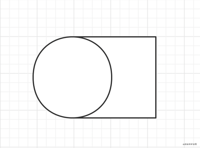
實現效果

需求/功能:
怎么用CSS+HTMl繪畫出一個愛心.
分析:
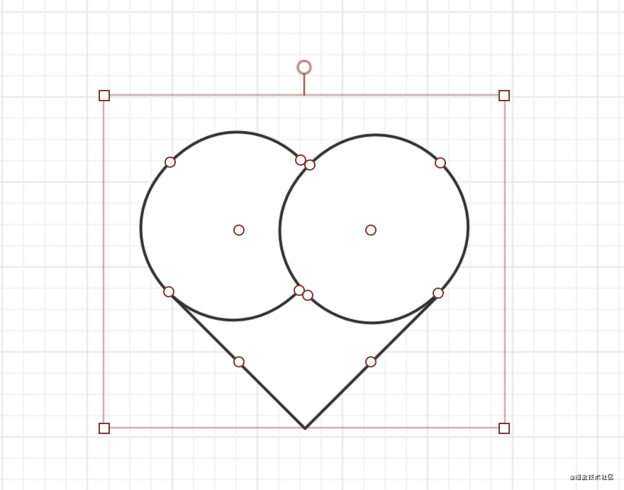
愛心可以通過一個正方形+兩個圓形組合成.
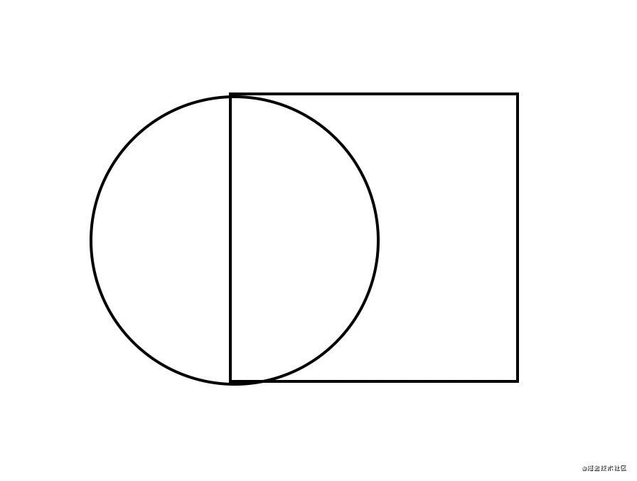
先畫一個正方形+圓形, 擺放位置如下:
再添加上一個圓形.

最后再將整個圖形順時針旋轉45度即可.
初步實現:
先畫一個正方形:
<body>
    <div id="heart"></div>
</body>
#heart{
       height: 300px;
       width: 300px;
       border: 2px solid black;
    }
給這個正方形的左邊加行一個圓形.這里使用偽類:before來實現
     #heart{
            height: 200px;
            width: 200px;
            border: 2px solid black;
            position: relative;
        }
    #heart:before{
        content: '';
        width: 200px;
        height: 200px;
        border: 2px solid black;
        border-radius: 50%; // 正方形加圓角變成圓
        position: absolute;
        left: -100px;  // 向左位移正方形一半的長度
    }
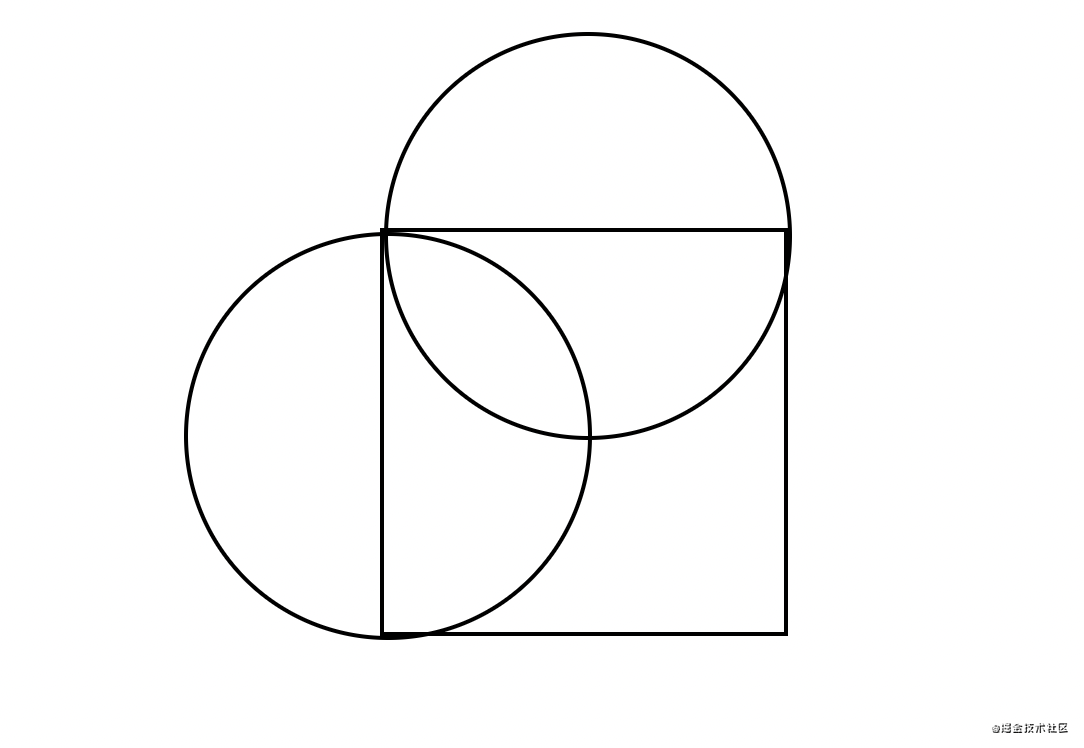
此時圖形長這樣:
再添加一個圓形, 這里使用after偽類來實現.
    #heart{
            height: 200px;
            width: 200px;
            border: 2px solid black;
            position: relative;
        }
        // 這里偷個懶.直接寫一塊了
    #heart:before,#heart:after{
        content: '';
        width: 200px;
        height: 200px;
        border: 2px solid black;
        border-radius: 50%;
        position: absolute;
        left: -100px;
    }
    // 第二個圓, 只需要向上位移正方形一半的高度
    #heart:after{
        left: 0;
        top: -100px;
    }
最后一步, 旋轉一下, 然后上個顏色.去掉之前為了看清楚加的邊框.
   /*給heart進行旋轉并加上顏色*/
  transform: rotate(45deg);
  background-color: red;
完整代碼:
<style>
        body,html{
            display: flex;
            align-items: center;
            justify-content: center;
            height: 100vh;
        }
        #heart{
            height: 200px;
            width: 200px;
            /*border: 2px solid black;*/
            position: relative;
            transform: rotate(45deg);
            background-color: red;
        }
        #heart:before,#heart:after{
            content: '';
            width: 200px;
            height: 200px;
            /*border: 2px solid black;*/
            border-radius: 50%;
            position: absolute;
            left: -100px;
            background-color: red;
        }
        #heart:after{
            left: 0;
            top: -100px;
        }
    </style>
</head>
<body>
    <div id="heart"></div>
</body>
總結:
愛心可以由一個正方形和兩個圓形組成, 這里使用before和after偽類, 然后, 分別對兩個偽類進行位移. 最后擠上顏色, 就可以實現一個愛心❤️.
以上就是用CSS3畫一個愛心的詳細內容����,更多關于CSS3畫一個愛心的資料請關注腳本之家其它相關文章�!
