<!DOCTYPE html>
<html lang="en">
<head>
<meta charset="UTF-8">
<title>CSS3點擊按鈕圓形進度打鉤效果</title>
<!--圖標庫-->
<link rel='stylesheet' >
<!--核心樣式-->
<link rel="stylesheet" href="css/style.css">
</head>
<body>
<div class="background">
<input type="checkbox" id="button">
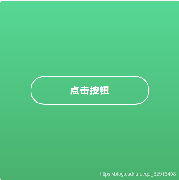
<label for="button" class="button"> 點擊按鈕<i class="fas fa-check"></i></label>
<svg class="circle">
<circle cx="32" cy="32" r="31">
</svg>
</div>
</body>
</html>
body {
margin: 0;
height: 100vh;
width: 100vw;
display: flex;
align-items: center;
justify-content: center;
font-family: "Lucida Sans Unicode", "Lucida Grande", sans-serif;
font-size: 14px;
}
.background {
position: relative;
background: linear-gradient(to top, #49b26e 0%, #57d895 100%);
border-radius: 5px;
display: flex;
align-items: center;
justify-content: center;
flex-direction: column;
box-shadow: 0 5px 15px 0 rgba(0, 0, 0, 0.25);
width: 400px;
height: 400px;
color: white;
}
.background input {
display: none;
}
.background .button {
display: flex;
justify-content: center;
align-items: center;
width: 260px;
height: 60px;
border: 2px solid white;
border-radius: 30px;
text-align: center;
font-size: 20px;
text-transform: uppercase;
font-weight: bold;
letter-spacing: 2px;
transition: all 0.3s ease-in-out;
cursor: pointer;
}
.background .button:hover {
background-color: #37be77;
}
.background .button .fas {
position: absolute;
color: #4caf50;
z-index: 2;
opacity: 0;
}
.background .circle {
position: absolute;
width: 65px;
height: 65px;
fill: none;
stroke: white;
stroke-width: 2px;
stroke-linecap: round;
stroke-dasharray: 183 183;
stroke-dashoffset: 183;
opacity: 0;
left: 0;
bottom: 0;
right: 0;
top: 0;
margin: auto;
pointer-events: none;
transform: rotate(-90deg);
}
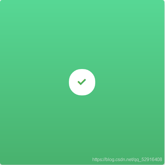
.background input:checked~.button {
animation: button 0.5s ease both, fill 0.5s ease-out 1.5s forwards;
}
.background input:checked~.button .fas {
animation: check 0.5s ease-out 1.5s both;
}
.background input:checked~.circle {
animation: circle 2s ease-out 0.5s both;
}
@keyframes button {
0% {
width: 260px;
left: 70px;
border-color: white;
color: white;
}
50% {
color: transparent;
}
100% {
width: 60px;
left: 170px;
border-color: #45b078;
background: transparent;
color: transparent;
}
}
@keyframes circle {
0% {
stroke-dashoffset: 183;
}
50% {
stroke-dashoffset: 0;
stroke-dasharray: 183;
transform: rotate(-90deg) scale(1);
opacity: 1;
}
90%,
100% {
stroke-dasharray: 500 500;
transform: rotate(-90deg) scale(2);
opacity: 0;
}
}
@keyframes fill {
0% {
background: transparent;
border-color: white;
}
100% {
background: white;
}
}
@keyframes check {
0% {
opacity: 0;
}
100% {
opacity: 1;
}
}
到此這篇關于CSS3點擊按鈕圓形進度打鉤效果的文章就介紹到這了,更多相關css3圓形進度按鈕內容請搜索腳本之家以前的文章或繼續瀏覽下面的相關文章,希望大家以后多多支持腳本之家!
