|
語法 |
說明 |
| from pyecharts.charts import Geo | 導入地圖庫 |
| Geo() | Pyecharts地理圖表繪制 |
| .add_map(maptype=“china“) | 地圖類型 |
| .add() | 添加數據 |
| .set_global_opts() | 設置全局配置項 |
實例代碼:
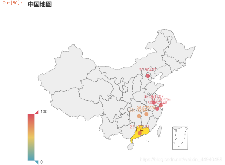
from pyecharts.charts import Geo
import pyecharts.options as opts
from commons import Faker

(
    Geo()
    .add_schema(maptype='china')    # 使用中國地圖的類型
    .add(series_name='', data_pair=[(i, j) for i, j in zip(Faker.provinces, Faker.values())])
    .set_global_opts(
        title_opts=opts.TitleOpts(title='中國地圖'),
        visualmap_opts=opts.VisualMapOpts(
#             is_piecewise=True   # 非連續型顯示
        )
    )
).render()
運行結果:
實例代碼:
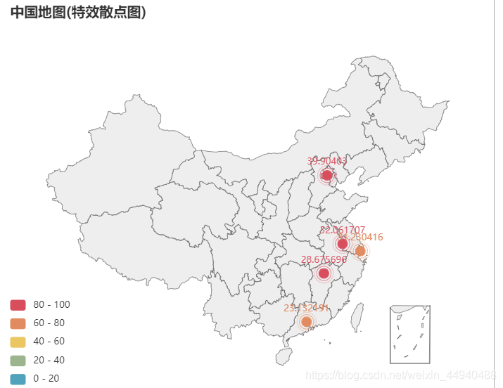
from pyecharts.charts import Geo
import pyecharts.options as opts
from pyecharts.globals import ChartType
from commons import Faker

(
    Geo()
    .add_schema(maptype='china')     # 使用中國地圖的類型
    .add(series_name='', data_pair=[(i, j) for i, j in zip(Faker.provinces, Faker.values())],
        type_=ChartType.EFFECT_SCATTER)
    .set_global_opts(
        title_opts=opts.TitleOpts(title='中國地圖(特效散點圖)'),
        visualmap_opts=opts.VisualMapOpts(
            is_piecewise=True
        )
    )
).render()
運行結果:
實例代碼:
from pyecharts.charts import Geo
from pyecharts.globals import ChartType, SymbolType
import pyecharts.options as opts

# 數據構建(元組形式)
city_num = [('廣州', 105), ('成都', 70), ('北京', 99), ('西安', 80)]
start_end = [('廣州', '成都'), ('廣州', '北京'), ('廣州', '西安')]

(
    Geo()
    .add_schema(maptype='china', itemstyle_opts=opts.ItemStyleOpts(color='#323c48', border_color='#111'))   # 地圖形式設置
    .add('', data_pair=city_num, color='white')    # 地圖數據顏色設置(點)
    .add('', data_pair=start_end, type_=ChartType.LINES,   # 設置線
         effect_opts=opts.EffectOpts(symbol=SymbolType.ARROW,color='blue', symbol_size=7))   # 流動箭頭繪制
).render()
運行結果:

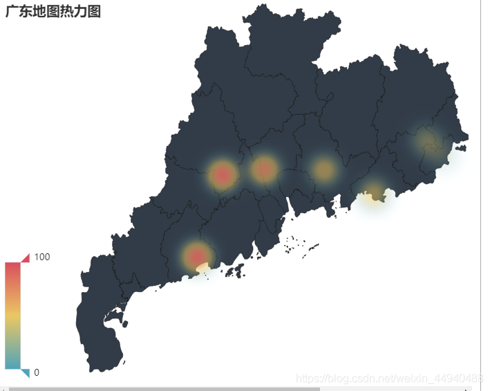
實例代碼:
from pyecharts.faker import Faker
from pyecharts import options as opts
from pyecharts.charts import Geo
from pyecharts.globals import ChartType

c = (
    Geo()
    .add_schema(maptype="廣東", itemstyle_opts=opts.ItemStyleOpts(color="#323c48", border_color="#111"),)
    .add("",[list(z) for z in zip(Faker.guangdong_city, Faker.values())],type_=ChartType.HEATMAP)
    .set_global_opts(
        visualmap_opts=opts.VisualMapOpts(),
        title_opts=opts.TitleOpts(title="廣東地圖熱力圖"),
    )
)

c.render()
運行結果:
實例代碼:
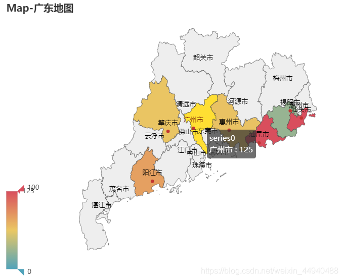
from pyecharts.charts import Map
from pyecharts import options as opts
from pyecharts.globals import ChartType

c = (
    Map()
    .add('', [list(z) for z in zip(Faker.guangdong_city, Faker.values())], "廣東")
    .set_global_opts(
        title_opts=opts.TitleOpts(title="Map-廣東地圖"),
        visualmap_opts=opts.VisualMapOpts(),
    )
)

c.render()
運行結果:
到此這篇關于Python數據可視化之基于pyecharts實現的地理圖表的繪制的文章就介紹到這了,更多相關pyecharts繪制地理圖表內容請搜索腳本之家以前的文章或繼續瀏覽下面的相關文章希望大家以后多多支持腳本之家!