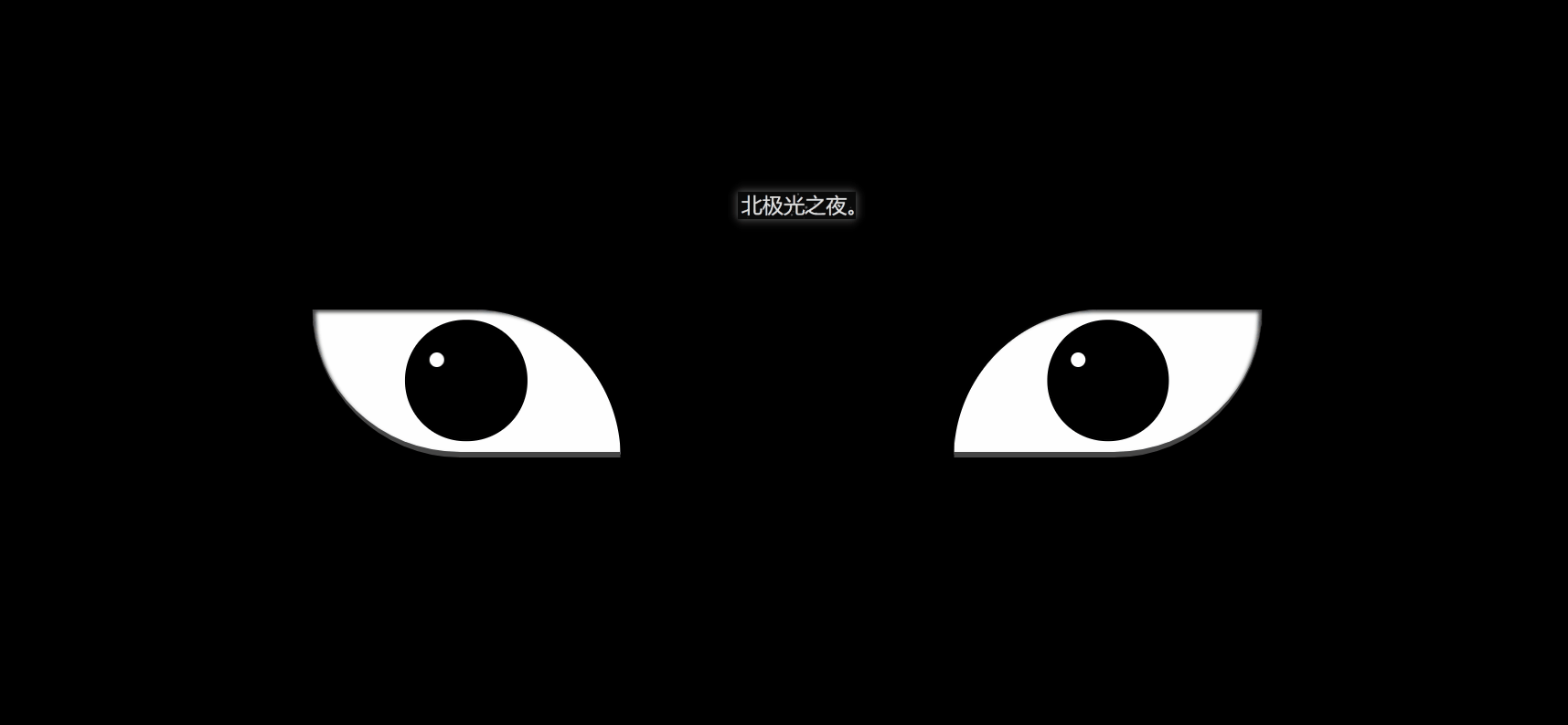
效果(完整代碼在底部):
實現并不難,都是重復的代碼比較多。
實現(可跟著一步一步寫):
1. 先定義基本標簽:
<!-- 血輪眼 -->
    <div class="zuo">
        <!-- 眼睛最中間那個黑點 -->
        <div class="zuoZong">
            <!-- 三勾玉所在的圈 -->
            <div class="zuoYu">
                <!-- 三個勾玉 -->
                <span class="yu"></span>
                <span class="yu"></span>
                <span class="yu"></span>
            </div>
        </div>
    </div>
    <!-- 輪回眼 -->
    <div class="you">
        <!-- 眼睛最中間那個黑點 -->
        <div class="dian"></div>
             <!-- 3個輪回圈 -->
            <div class="youYu">
                <span class="quan" style="--r:2;"></span>
                <span class="quan" style="--r:3;"></span>
                <span class="quan" style="--r:4;"></span>
            </div>
    </div>
2. 定義左右眼的基本css樣式:
.zuo , .you{
            width: 250px;
            height: 120px;
            background-color: rgb(255, 255, 255);
            border-bottom: 5px solid rgb(70, 70, 70);
            overflow: hidden;
            position: relative;
        }
border-bottom: 5px solid rgb(70, 70, 70); 給個灰色的眼底。
overflow:溢出隱藏。
position: relative; 相對定位。
3. 開始先定義血輪眼的基本樣式:
.zuo{
            transform: translateX(-135px);
            border-radius: 0 120px 0 120px;
            box-shadow: inset 3px 2px 3px  rgba(17, 17, 17, 0.8);
        }
transform: translateX(-135px); 向左偏移,讓兩眼分開。
border-radius:給兩個角設置弧度,形成眼睛形狀。
bos-shadowL給眼角一點陰影。
4. 設置眼球寬高等:
.zuo::after{
            content: '';
            position: absolute;
            top: 50%;
            left: 50%;
            transform: translate(-50%,-50%);
            width: 95px;
            height: 95px;
            border-radius: 50%;
            border: 2px solid #000;
            animation: colour 2s linear forwards;
        }
        @keyframes colour{
            0%,30%{
                background-color: rgb(0, 0, 0);
            }
            100%{
                 background-color: rgb(255, 4, 4);
             }
         }
position: absolute; 絕對定位
top: 50%;
left: 50%;
transform: translate(-50%,-50%); 居中對齊。
animation:設置動畫,讓其變紅色。forward:繼承最后一幀的屬性。
background-color: rgb(0, 0, 0); 黑色
background-color: rgb(255, 4, 4); 紅色。
5. 設置眼球正中間的黑點,都是些定位大小啥的,然后設置動畫然它慢慢變大:
 .zuoZong{
            position: absolute;
            top: 50%;
            left: 50%;
            transform: translate(-50%,-50%);
            width: 0px;
            height: 0px;
            border-radius: 50%;
            background-color: rgb(0, 0, 0);
            z-index: 1;
            animation: da 3s linear forwards;
        }
        @keyframes da{
            100%{
                width: 15px;
            height: 15px;
            }
        }
6. 設置三勾玉所在的圈,設置動畫讓其顯示與旋轉:
.zuoYu{
            position: absolute;
            top: -25px;
            left: -25px;
            bottom: -25px;
            right: -25px;
            border-radius: 50%;
            border: 2px solid rgb(0, 0, 0);
            animation: zhuan 2s linear 2s forwards;
            opacity: 0;
        }
        @keyframes zhuan{

            100%{
                opacity: 1;
                transform: rotate(720deg);
            }
        }
position: absolute;
top: -25px;
left: -25px;
bottom: -25px;
right: -25px; 大小。
border-radius: 50%;圓形。
border: 2px solid rgb(0, 0, 0); 黑色邊框。
opacity:0;透明度為0;
transform: rotate(720deg); 旋轉720度。
7. 制作三勾玉,先做一個圓,再用雙偽類制作一個圓弧,兩者結合就是勾玉了:
.zuoYu .yu{
             position: absolute;
             width: 15px;
             height: 15px;
             border-radius: 50%;
             background-color: rgb(0, 0, 0);

        }
        .zuoYu .yu::after{
            content: '';
            position: absolute;
            top: -6px;
            left: -1px;
            width: 6px;
            height: 20px;
            border-radius: 50%;
            border-left: 6px solid rgb(0, 0, 0);
        }
border-radius: 50%;
border-left: 6px solid rgb(0, 0, 0);
先讓偽類為圓,再只設置一條邊框,圓弧形成,再定位在父元素上,形成勾玉。
8. 給勾玉設置動畫,讓其從最中間變大旋轉到勾玉所在的圈:
.zuoYu .yu:nth-child(1){
            animation: yu1 2s ease-in 2s  forwards;
        }
        @keyframes yu1{
            0%{
                opacity: 0;
                left: 50%;
                top: 50%;
                transform:translate(-50%,-50%)  scale(0.1) ;
            }
            100%{
                left: 50%;
                top: -9%;
                transform: scale(1) rotate(80deg);
            }
        }
left: 50%;
top: 50%; 在最中間。
opacity:透明。
scale(0.1);縮小。
100%{…}到對應位置,同時變不透明和放大成正常大小。
9. 一樣的,給其它兩個勾玉動畫:
.zuoYu .yu:nth-child(2){
            animation: yu2 2s ease-in 2s forwards;
        }
        @keyframes yu2{
            0%{
                opacity: 0;
                left: 50%;
                top: 50%;

                transform: translate(-50%,-50%) scale(0.1) ;
            }
            100%{
                top: 60%;
                left: -9%;
                transform: scale(1) rotate(-60deg);
            }
        }
        .zuoYu .yu:nth-child(3){
            animation: yu3 2s ease-in 2s forwards;
        }
        @keyframes yu3{
            0%{
                opacity: 0;
                right: 50%;
                top: 50%;

                transform: translate(-50%,-50%) scale(0.1);
            }
            100%{
                top: 60%;
                right: -9%;
                transform: scale(1) rotate(180deg);
            }
        }
10.給兩個眼睛都設置一個白點,相當于反光效果吧,至此血輪眼做完了:
.zuo::before,.you::before{
            content: '';
            position: absolute;
            left: 38%;
            top: 30%;
            width: 12px;
            height: 12px;
            border-radius: 50%;
            background-color: rgb(255, 255, 255);
            z-index: 10;
        }
position: absolute;
left: 38%;
top: 30%; 定位相應的位置。
background-color: rgb(255, 255, 255); 白色。
z-index: 10; 設置為10,顯示在最上層。
11.設置輪回眼基本css樣式,跟血輪眼一樣:
.you{
            transform: translateX(135px);
            border-radius:  120px 0 120px 0;
            box-shadow: inset -3px 2px 3px  rgba(17, 17, 17, 0.8);
        }
12.設置眼球寬高等:
.you::after{
            content: '';
            position: absolute;
            top: 50%;
            left: 50%;
            transform: translate(-50%,-50%);
            width: 95px;
            height: 95px;
            border-radius: 50%;
            border: 2px solid #000;
            animation: youcolor 2s linear forwards;
         }
         @keyframes youcolor{
            0%,30%{
                background-color: rgb(0, 0, 0);
            }
            100%{
                 background-color: rgb(144, 130, 183);

             }
         }
position: absolute; 絕對定位
top: 50%;
left: 50%;
transform: translate(-50%,-50%); 居中對齊。
animation:設置動畫,讓其變紫色。forward:繼承最后一幀的屬性。
background-color: rgb(0, 0, 0); 黑色
background-color: rgb(144, 130, 183); 紫色。
13. 設置眼球最中間的黑點,跟血輪眼也差不多:
.dian{
             position: absolute;
            top: 50%;
            left: 50%;
            background-color: #000;
            transform: translate(-50%,-50%);
            border-radius: 50%;
            z-index: 10;
            animation: youda 3s linear forwards;
         }
         @keyframes youda{
             0%{
                height: 0px;
            width: 0px;
             }
             100%{
                height: 15px;
            width: 15px;
             }
         }
14. 設置輪回眼每個圈,同時設置動畫讓其變大:
.youYu{
            position: absolute;
          top: 50%;
          left: 50%;
          transform: translate(-50%,-50%);
       }
       .quan{
           position: absolute;
           border-radius: 50%;
           border: 2px solid #000;
           z-index: calc(1 - var(--r));
           animation: zhi 2s ease-out 2s forwards;
       }
       @keyframes zhi{
           0%{
            top: calc(var(--r) * 1px);
           left: calc(var(--r) * 1px);
           right: calc(var(--r) * 1px);
           bottom: calc(var(--r) * 1px);
           }
           100%{
            top: calc(var(--r) * -35px);
           left: calc(var(--r) * -35px);
           right: calc(var(--r) * -35px);
           bottom: calc(var(--r) * -35px);

               background-color: rgb(187, 177, 214);
           }
       }
z-index: calc(1 - var(–r)); 計算,讓最開始的圈顯示在最上層。
animation:設置動畫,讓輪回圈慢慢變大,同時變成紫色。
完整代碼:
<!DOCTYPE html>
<html lang="zh-CN">
<head>
    <meta charset="UTF-8">
    <meta http-equiv="X-UA-Compatible" content="IE=edge">
    <meta name="viewport" content="width=device-width, initial-scale=1.0">
    <title>Document</title>
    <style>
        *{
            margin: 0;
            padding: 0;
            box-sizing: border-box;
        }
        body{
            height: 100vh;
            display: flex;
            justify-content: center;
            align-items: center;
            background-color: #000;
        }
        .zuo , .you{
            width: 250px;
            height: 120px;
            background-color: rgb(255, 255, 255);
            border-bottom: 5px solid rgb(70, 70, 70);
            overflow: hidden;
            position: relative;
        }

        .zuo{
            transform: translateX(-135px);
            border-radius: 0 120px 0 120px;
            box-shadow: inset 3px 2px 3px  rgba(17, 17, 17, 0.8);
        }
        .zuo::after{
            content: '';
            position: absolute;
            top: 50%;
            left: 50%;
            transform: translate(-50%,-50%);
            width: 95px;
            height: 95px;
            border-radius: 50%;
            border: 2px solid #000;
            animation: colour 2s linear forwards;
        }
        @keyframes colour{
            0%,30%{
                background-color: rgb(0, 0, 0);
            }
            100%{
                 background-color: rgb(255, 4, 4);
             }
         }

        .zuoZong{
            position: absolute;
            top: 50%;
            left: 50%;
            transform: translate(-50%,-50%);
            width: 0px;
            height: 0px;
            border-radius: 50%;
            background-color: rgb(0, 0, 0);
            z-index: 1;
            animation: da 3s linear forwards;
        }
        @keyframes da{
            100%{
                width: 15px;
            height: 15px;
            }
        }
        .zuoYu{
            position: absolute;
            top: -25px;
            left: -25px;
            bottom: -25px;
            right: -25px;
            border-radius: 50%;
            border: 2px solid rgb(0, 0, 0);
            animation: zhuan 2s linear 2s forwards;
            opacity: 0;
        }
        @keyframes zhuan{

            100%{
                opacity: 1;
                transform: rotate(720deg);
            }
        }
        .zuoYu .yu{
             position: absolute;
             width: 15px;
             height: 15px;
             border-radius: 50%;
             background-color: rgb(0, 0, 0);

        }
        .zuoYu .yu::after{
            content: '';
            position: absolute;
            top: -6px;
            left: -1px;
            width: 6px;
            height: 20px;
            border-radius: 50%;
            border-left: 6px solid rgb(0, 0, 0);
        }
        .zuoYu .yu:nth-child(1){
            animation: yu1 2s ease-in 2s  forwards;
        }
        @keyframes yu1{
            0%{
                opacity: 0;
                left: 50%;
                top: 50%;

                transform:translate(-50%,-50%)  scale(0.1) ;
            }
            100%{
                left: 50%;
                top: -9%;
                transform: scale(1) rotate(80deg);
            }
        }
        .zuoYu .yu:nth-child(2){
            animation: yu2 2s ease-in 2s forwards;
        }
        @keyframes yu2{
            0%{
                opacity: 0;
                left: 50%;
                top: 50%;

                transform: translate(-50%,-50%) scale(0.1) ;
            }
            100%{
                top: 60%;
                left: -9%;
                transform: scale(1) rotate(-60deg);
            }
        }
        .zuoYu .yu:nth-child(3){
            animation: yu3 2s ease-in 2s forwards;
        }
        @keyframes yu3{
            0%{
                opacity: 0;
                right: 50%;
                top: 50%;

                transform: translate(-50%,-50%) scale(0.1);
            }
            100%{
                top: 60%;
                right: -9%;
                transform: scale(1) rotate(180deg);
            }
        }
        .zuo::before,.you::before{
            content: '';
            position: absolute;
            left: 38%;
            top: 30%;
            width: 12px;
            height: 12px;
            border-radius: 50%;
            background-color: rgb(255, 255, 255);
            z-index: 10;
        }
        .you{
            transform: translateX(135px);
            border-radius:  120px 0 120px 0;
            box-shadow: inset -3px 2px 3px  rgba(17, 17, 17, 0.8);
/*             filter: drop-shadow( 8px -5px 3px  rgb(216, 59, 59));
 */        }
         .you::after{
            content: '';
            position: absolute;
            top: 50%;
            left: 50%;
            transform: translate(-50%,-50%);
            width: 95px;
            height: 95px;
            border-radius: 50%;
            border: 2px solid #000;
            animation: youcolor 2s linear forwards;
         }
         @keyframes youcolor{
            0%,30%{
                background-color: rgb(0, 0, 0);
            }
            100%{
                 background-color: rgb(144, 130, 183);

             }
         }

         .dian{
             position: absolute;
            top: 50%;
            left: 50%;
            background-color: #000;
            transform: translate(-50%,-50%);
            border-radius: 50%;
            z-index: 10;
            animation: youda 3s linear forwards;
         }
         @keyframes youda{
             0%{
                height: 0px;
            width: 0px;
             }
             100%{
                height: 15px;
            width: 15px;
             }
         }
         .youYu{
            position: absolute;
          top: 50%;
          left: 50%;
          transform: translate(-50%,-50%);
       }
       .quan{
           position: absolute;
           border-radius: 50%;
           border: 2px solid #000;
           z-index: calc(1 - var(--r));
           animation: zhi 2s ease-out 2s forwards;
       }
       @keyframes zhi{
           0%{
            top: calc(var(--r) * 1px);
           left: calc(var(--r) * 1px);
           right: calc(var(--r) * 1px);
           bottom: calc(var(--r) * 1px);
           }
           100%{
            top: calc(var(--r) * -35px);
           left: calc(var(--r) * -35px);
           right: calc(var(--r) * -35px);
           bottom: calc(var(--r) * -35px);

               background-color: rgb(187, 177, 214);
           }
       }
    </style>
</head>
<body>
    <!-- 血輪眼 -->
    <div class="zuo">
        <!-- 眼睛最中間那個黑點 -->
        <div class="zuoZong">
            <!-- 三勾玉所在的圈 -->
            <div class="zuoYu">
                <!-- 三個勾玉 -->
                <span class="yu"></span>
                <span class="yu"></span>
                <span class="yu"></span>
            </div>
        </div>
    </div>
    <!-- 輪回眼 -->
    <div class="you">
        <!-- 眼睛最中間那個黑點 -->
        <div class="dian"></div>
             <!-- 3個輪回圈 -->
            <div class="youYu">
                <span class="quan" style="--r:2;"></span>
                <span class="quan" style="--r:3;"></span>
                <span class="quan" style="--r:4;"></span>
            </div>
    </div>
</body>
</html>
到此這篇關于html+css實現血輪眼輪回眼特效 的文章就介紹到這了,更多相關html血輪眼輪回眼特效 內容請搜索腳本之家以前的文章或繼續瀏覽下面的相關文章,希望大家以后多多支持腳本之家!
