本文主要介紹了純CSS3實現圓圈動態發光特效動畫的示例代碼,分享給大家,具體如下:
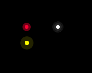
效果圖:
代碼:
<!DOCTYPE HTML>
<html>
<head>
    <title>純CSS3實現圓圈動態發光特效動畫</title>
    <style>
        body {
            background-color: #000000;
        }

        @keyframes twinkling {
            0% {
                opacity: 0.2;
                transform: scale(1);
            }

            50% {
                opacity: 0.5;
                transform: scale(1.12);
            }

            100% {
                opacity: 0.2;
                transform: scale(1);
            }
        }

        .circle-wrap {
            position: absolute;
            left: 100px;
            top: 100px;
        }

        .circle {
            position: relative;
            width: 24px;
            height: 24px;
        }

        .small-circle {
            border-radius: 50%;
            width: 12px;
            height: 12px;
            background: #FF0033;
            position: absolute;
        }

        .big-circle {
            position: absolute;
            top: -6px;
            left: -6px;
            width: 100%;
            height: 100%;
            border-radius: 50%;
            background: #FF0033;
            animation: twinkling 1s infinite ease-in-out;
            animation-fill-mode: both;
        }

        @keyframes scale {
            0% {
                transform: scale(1)
            }

            50%,
            75% {
                transform: scale(3)
            }

            78%,
            100% {
                opacity: 0
            }
        }

        @keyframes scales {
            0% {
                transform: scale(1)
            }

            50%,
            75% {
                transform: scale(2)
            }

            78%,
            100% {
                opacity: 0
            }
        }

        .smallcircle2 {
            position: absolute;
            width: 12px;
            height: 12px;
            background-color: #ffffff;
            border-radius: 50%;
            top: 100px;
            left: 200px;
        }

        .smallcircle2:before {
            content: '';
            display: block;
            width: 12px;
            height: 12px;
            border-radius: 50%;
            opacity: .4;
            background-color: #ffffff;
            animation: scale 1s infinite cubic-bezier(0, 0, .49, 1.02);
        }

        .bigcircle2 {
            position: absolute;
            width: 12px;
            height: 12px;
            border-radius: 50%;
            opacity: .4;
            background-color: #ffffff;
            top: 100px;
            left: 200px;
            animation: scales 1s infinite cubic-bezier(0, 0, .49, 1.02);
        }

        @keyframes scaless {
            0% {
                transform: scale(1)
            }

            50%,
            75% {
                transform: scale(3)
            }

            78%,
            100% {
                opacity: 0
            }
        }

        .item {
            position: absolute;
            width: 14px;
            height: 14px;
            background-color: #FFFF00;
            border-radius: 50%;
            top: 150px;
            left: 100px;
        }

        .item:before {
            content: '';
            display: block;
            width: 14px;
            height: 14px;
            border-radius: 50%;
            opacity: .7;
            background-color: #FFFF00;
            animation: scaless 1s infinite cubic-bezier(0, 0, .49, 1.02);
        }
    </style>
</head>
<body>
    <div class="circle-wrap">
        <div class="circle">
            <div class="big-circle"></div>
            <div class="small-circle"></div>
        </div>
    </div>
    <div class="smallcircle2"></div>
    <div class="bigcircle2"></div>
    <div class="item"></div>
</body>
</html>
這個效果的具體實現主要是用到了CSS3 的animation
它共有8個屬性:
animation-name 規定 @keyframes 動畫的名稱。
用來定義一個動畫的名稱。
如果要設置幾個animation給一個元素,我們只需要以列表的形式,用逗號“,”隔開
animation-duration 動畫時長
用來指定元素播放一個周期的動畫所持續的時間長,單位為秒(s)或毫秒(ms),默認值為0
animation-timing-function 規定動畫的速度曲線。默認是 “ease”。
linear 規定以相同速度開始至結束的過渡效果(等于 cubic-bezier(0,0,1,1))。 ease 規定慢速開始,然后變快,然后慢速結束的過渡效果(cubic-bezier(0.25,0.1,0.25,1))。
ease-in 規定以慢速開始的過渡效果(等于 cubic-bezier(0.42,0,1,1))。
ease-out 規定以慢速結束的過渡效果(等于 cubic-bezier(0,0,0.58,1))。
ease-in-out 規定以慢速開始和結束的過渡效果(等于 cubic-bezier(0.42,0,0.58,1))。
cubic-bezier(n,n,n,n) 在 cubic-bezier 函數中定義自己的值。可能的值是 0 至 1 之間的數值。
animation-delay 規定動畫何時開始。默認是 0。允許負值,動畫跳過 2 秒進入動畫周期,也就是從2s的動畫開始
animation-iteration-count 規定動畫被播放的次數。默認是 1
animation-direction 規定動畫是否在下一周期逆向地播放。默認是 “normal”。
animation-fill-mode 規定動畫在播放之前或之后,其動畫效果是否可見。
animation-play-state 規定動畫是否正在運行或暫停。默認是 “running”。
綜合起來簡寫
animation : name duration timing-function delay iteration-count direction fill-mode play-state
原文:https://blog.csdn.net/qq_34576876/article/details/95532946
https://blog.csdn.net/weixin_42541698/article/details/102686976
到此這篇關于純CSS3實現圓圈動態發光特效動畫的示例代碼的文章就介紹到這了,更多相關CSS3圓圈動態發光內容請搜索腳本之家以前的文章或繼續瀏覽下面的相關文章,希望大家以后多多支持腳本之家!
